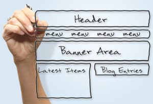
The average a person spends between 30 seconds to 2 minutes on a website. That means you must grab a customer’s attention, and grab it fast! My overall take on a website’s aesthetics are to be clean, easily navigated and inviting. Let me break it down for you.
Whether you are trying to attract new business or just need a place to show off your past projects, a website is what you need! Potential clients will look online first for the services they need before calling the number on a sign or truck. Having a website is the tool you need to attract new business and manage the clients you have now.
A website makes a business look more established and trustworthy. There are user friendly sites such as Wix that allow you to easily create a generic website. Feeling adventurous? You can also try using WordPress, although you may need to hire a professional for help. Here are some tips for your site.
Creating a Clean Website
When I say clean I literally mean you should dust off the cob webs and make me feel like I am walking into a shiny marble covered house. You want to create visual engagement without overwhelming. There are some exceptions to the rules because every company is targeting a different demographic but here are the basics:
 Clean Lines: no hearts, stars or cloud shaped boxes
Good Use of Dead Spaces: It’s ok to have some space that isn’t consumed with writing or pictures. Blank spaces make it easier to find and read content.
Not Over Cluttered: This goes back to using dead spaces, if you have too much information and pictures crammed into one page a reader will get overwhelmed and will leave your site. Readers like short, to the point paragraphs. When appropriate, try putting articles and other content into bulleted or numbered lists. Lists make it much easier to read and people are more likely to read through the end than with long paragraphs. Over cluttering will also hinder the navigability of your site, read more below.
Defined Color Scheme: Have you ever gone on a site where there were 400 different colors being used? The header was green, the text was bright yellow, the logo was purple and all the links were orange (something to that extent)? Adding too many colors is confusing and can make a site hard to read. Over all the site should reflect the colors of your company. Typically, I advise to keep it at one or two colors, sometimes a third is ok. Think about it, every big company you know follows that rule: McDonalds (yellow and red), Starbucks (green), Speedway (red), and so on. Generally simple is better. Keep your text bodies to black lettering, your font readable and your header tabs visible.
Creating an Easily Navigated Website
Navigation Tabs: It is standard for navigation tabs to be in the top right corner of desktop screen however, feel free to explore themes that have diverse set ups. I once worked with a theme that had the tabs in a box going down the left  side, I hated it, but for some companies that may be a better set up. Design aspects of a website are mostly based on the needs and desired function for a company. It just depends what you want your site to do. Navigation tabs are your friend, they serve as a hub for your customers to find out more about what you are trying to tell them. So, it is always better to keep it simple.
If I am looking to find out more about your business I should find a tab that reads “About, About Us, Our Story” … something like this. If you get too creative with naming your menu it will confuse your visitors and they are less likely to keep clicking around to find what they are looking for. For instance, naming an “About” page “How We Keep It Real” is probably not clear enough and will be confusing. Also, don’t use too many or too few tabs. On average 5-6 tabs should be a max. However, you can add a dropdown menu to each tab. For instance: you hover your mouse over the “About” tab and a dropdown appears reading, “Our Company, Our Clients, Our Staff”. Doing this will keep your top bar less cluttered while allowing users to more easily find their desired search.
Search Bar: You should have a search bar and it should work. Yes, this seems self-explanatory but I can’t tell you how many times I have gotten on a site and they have a search bar, but it won’t function. It is frustrating and if I can’t find what I am looking for after a few seconds I will most likely leave the site. Search bars can reside in several various places depending on your site theme. They are typically in the footer, header or right bar on each page of a site.
Contact Information: Many times, users will visit a site solely looking for hours of operation, a contact number or email, and/or your address. Depending on the size of your company, an abbreviated version of your contact info should be in the header of each page. This info would usually just be a phone number and email, but some may choose to add their address as well.
Consistent Page Layout: This is easy; each page needs to look uniform. Obviously, each page serves a different purpose so it will look a little different but the following need to be consistent:

- Header
- Footer
- Side Bars (somethings may rotate on these but if one page has a sidebar they all need one and they need to be on the same side of each page)
- Navigation Tabs and Dropdowns
- Search Bar
- Logo Placement
This makes it easier for people to find what they are looking for and find it quickly.
Mobile Friendly: In a world focused on handheld devices, it is no surprise that nearly 60% of searches are done on a mobile device. If a customer tries to access your site mobile and cannot read it or navigate efficiently, they will move on to a different site. To remain relevant is to appeal to the masses of mobile user. To check if your site is mobile friendly you have several options. One, adjust your screen size manually on a desktop while you have your site open on a tab. Second, most themes on WordPress have a small phone icon on the bottom of the screen when you are in appearance editing mode. Pressing this button gives you a preview for your site on a phone. Third, pull your site up on your phone or other mobile device and look for any flaws.
Creating an Inviting Website
To create an inviting website, you need to make sure your information is accurate, reliable, and updated. I take the knowledge of editing a site and time, to create and consistently update information. Sites that are outdated are automatically unappealing and will deter visitors. The front page is the first impression to your site. Make a site inviting with the language and images you use. Too bright or too dark of colors are not as appealing to the eye. Also, think about the meaning of colors. For instance, red typically reflects anger or aggression. You want your site to give the right first impression!
Good Luck!


